Google Docs
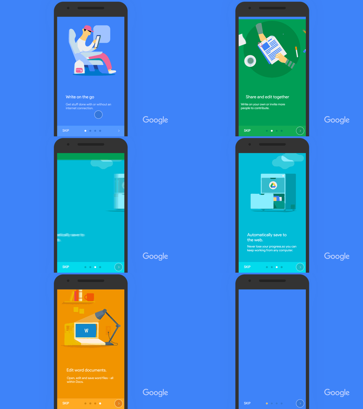
In the Google Docs app onboarding, Google illustrates the contexts in which Docs will change how users handle their documents. So, rather than spending the user’s first seconds showing them where the fonts are, Google explains how interacting with its product will transform how you think about working with documents.
Dropbox

This is an excellent example of a product illustrating how an app will benefit users in specific life contexts, rather than simply listing features. Being able to backup photos on the bus and quickly send videos to friends means much more to users than a list of features.
Boomer App
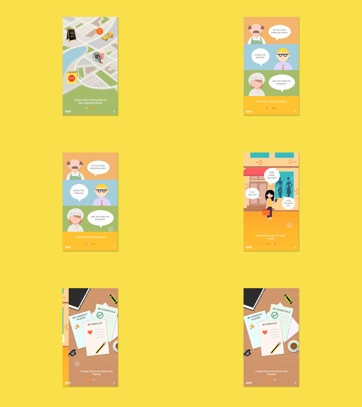
This product effectively illustrates the human interactions that the app can improve, such as potential conversations and city contexts. Illustrations are important, but if they don’t communicate value to users, then they’re useless.
Citrus App

HubSpot
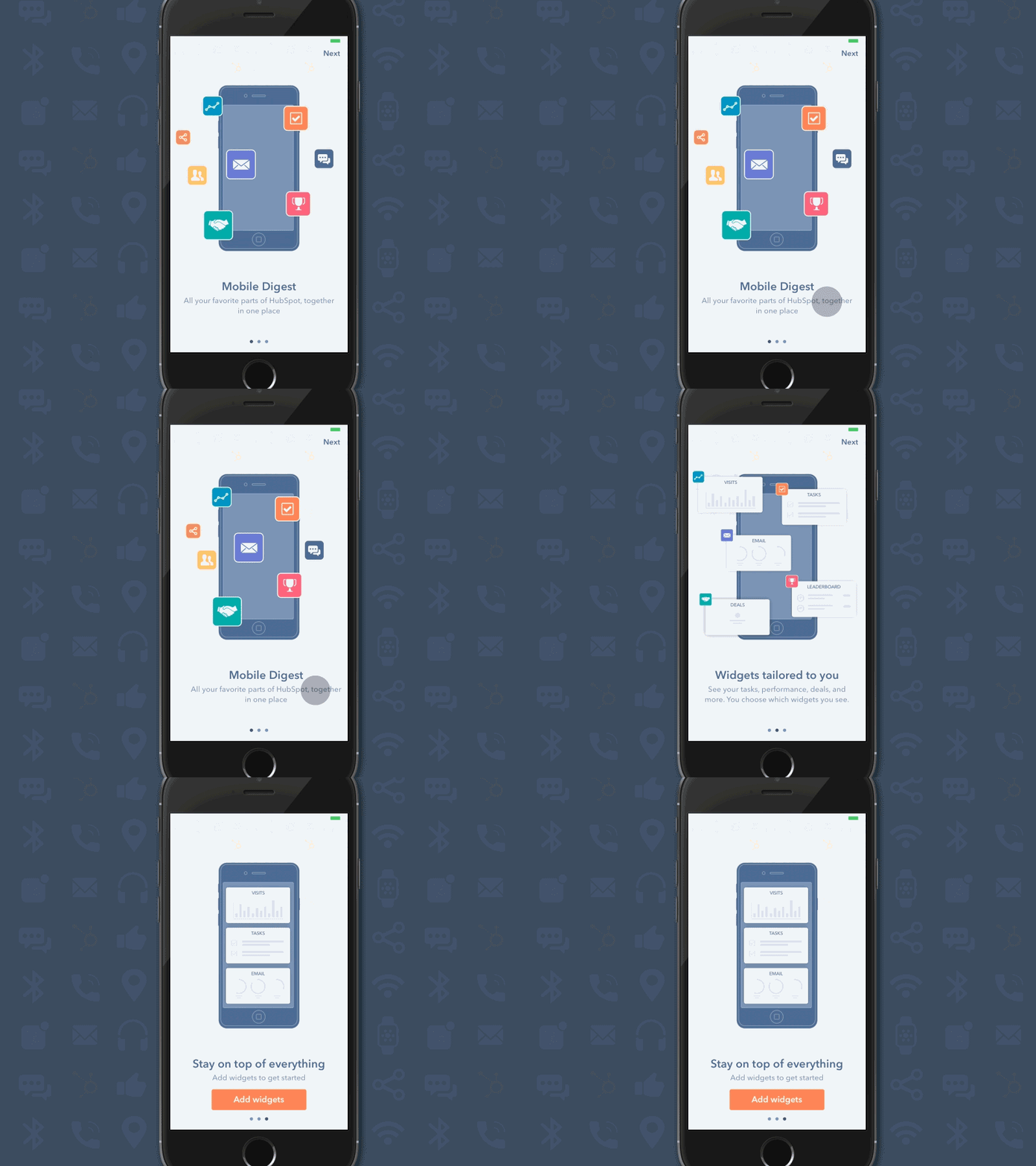
HubSpot shows that their new widgets enable customization, how this will appear on the device, and what that means for their product as a whole. The bold copy text in this onboarding process is succinct and leaves no room for questions.
Bot Onboarding

The end of apps is an increasingly contentious topic. Many products are trading in their apps for chatbots that operate within a messenger. As with apps, bots need to introduce themselves too. The personal quality of bots has thus far been a friendly way to get signup information from users.
McDonalds

These McDonalds animations beautifully transition from frame-to-frame, all with the single dot. The quality of this sequence instills confidence in the user that the rest of their experience with the product will be as polished.
Delibarry
Survey
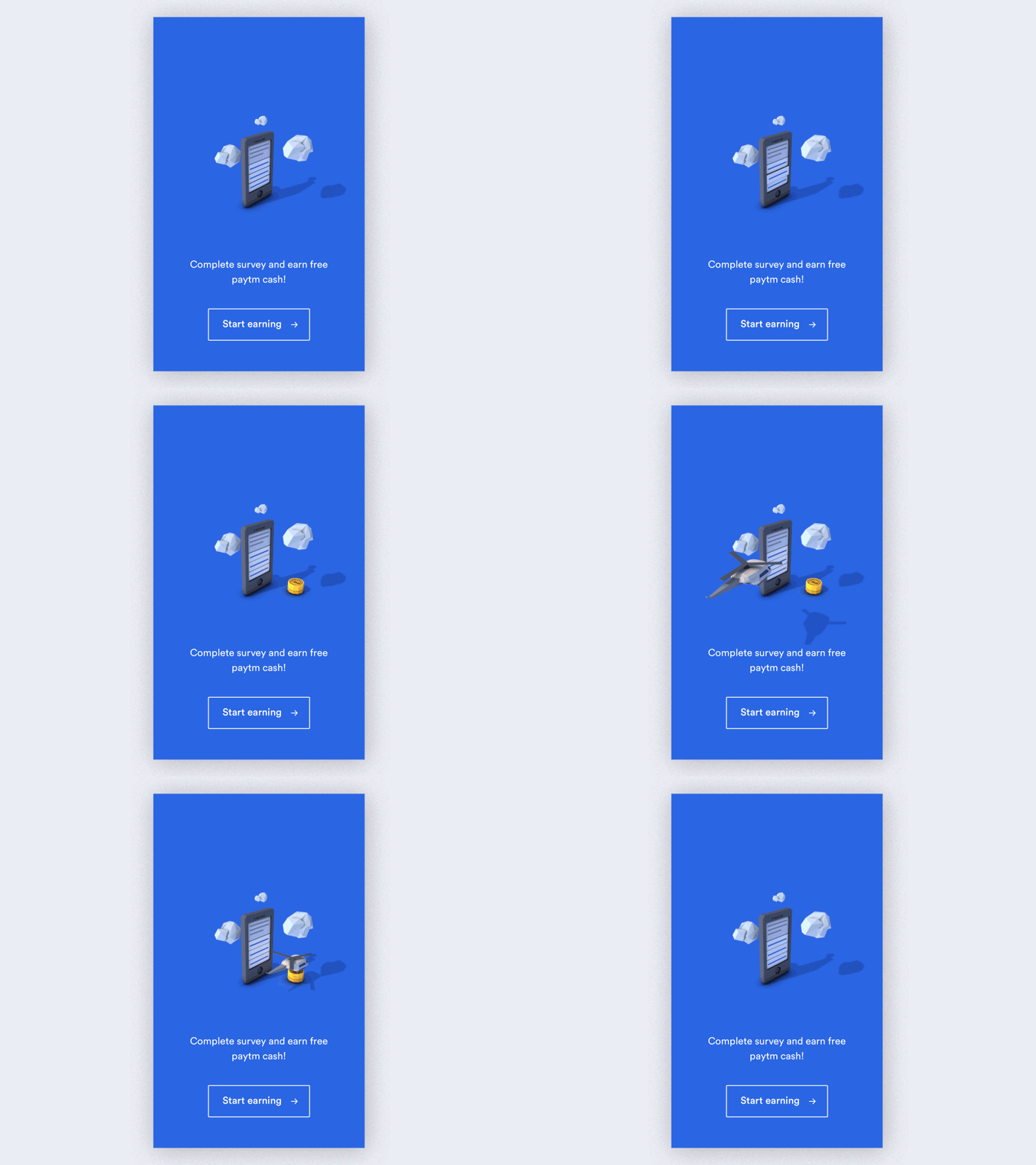
The communicated action for this onboarding is pretty simple, but the designer used the opportunity to experiment with a type of animation that is less common than the average flat graphics. Viewers might be so intrigued with the image that they’ll have to comply with the survey.
Percolate Mobile

In some cases, the onboarding process displays itself in action. If a product requires a slightly more complex interface, then this can be a great way to walk users through the basics of using the app. Just don’t bore them to death.
Dating App

Onboarding presents an opportunity to secure information from users. Sign up sheets are obviously a big turn off. This dating app makes it enjoyable with its interactive method.
Local Delivery

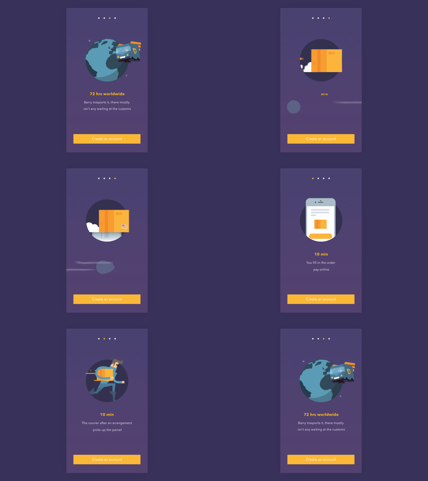
This onboarding process keeps the copy simple, which implies that the service itself is simple. If your onboarding requires users to read a wall of text, they may be put off that your product will be tedious as well. Generally, try to communicate to users as efficiently as possible.
Friendly App

Simulating the potential conversations that could take place within this app is a great way to instill confidence that the service will lead to great experiences. In this case, meeting strangers can be intimidating, so this friendly interface could go a long way.


