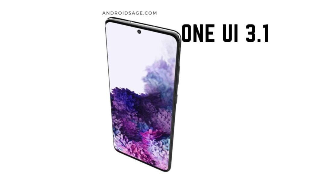
The arrival of the Samsung Galaxy S21 line means a new interface designed by Samsung for Android 11. Only this improvement is not limited to just new phones; Existing Galaxy S and Note models also have One UI 3.
The change should be welcomed by Galaxy phone users. One UI 3 comes with a litany of cool features as well as a radical new design. It’s on its way to Samsung Galaxy devices starting January 14, and Galaxy S20 users in the United States, Korea, and Europe will be the first to get the update.
Devices that receive One UI 3 will get a full overhaul, including a new lock screen, home screen, notification center, and quick panel.
All of these areas receive enhanced motion and animation effects with additional haptic feedback. There is an option to redesign the widgets and also add Dim or Blur for notifications.
Some of the new One UI 3 widgets give you more access to additional information on your phone without having to unlock the device. This includes the weather, your calendar, music, Bixby routines, screen time, and more.
You can also change their size and transparency levels, which makes them much more manageable in the beginning. The posts are grouped and centered to stay in the minds of the users. There’s also a new setting for full-screen edge-to-edge video calls reminiscent of Apple’s FaceTime.
Features of The New Samsung One UI 3.0
If you’re still waiting for One UI 3.0 and want to know what to expect, we’ve rounded up all the notable changes here. Do you already have the update? You can use this to make sure you take advantage of all the newer features.
We will not discuss all new Android 11 features here. While most are included with the Samsung software update, they are not exclusive to One UI so there is no point in repeating them.
Samsung One UI 3.0: Notification refresh
One of the biggest areas Google focused on with Android 11 was notifications. Since the notification tone is critical for keeping in touch with friends and family, Google has put a lot of emphasis on making it more organized and streamlined.
Following Google’s example, Samsung has also paid a lot of attention to the notification shade in One UI 3.0. The company has updated the entire look of the screen by adding a new light gray color (when dark mode is not in use) and new fade-in animation. Everything is very smooth and elegant.
Samsung has also removed a few things to make the screen less cluttered. For example, the power button has disappeared from the top right corner. It’s refreshing to see Samsung take a “less is more” approach here.
Ultimately, however, the most notable changes are those made by Android 11. The music player exits the system tray and goes to the Quick Tiles section, and each notification is categorized under different headings based on its importance.
As usual, you can long-press the notifications to change how the operating system should treat them.
News Alerts and Calling Support
Speaking of notifications, Samsung has tweaked the way alerts appear on your screen while you’re actively using the phone. When I entered a notification with Android 10, I got a big warning in the top quarter of the screen.
This would have shortcuts to application functions (reply, delete, ignore, etc.) and/or predefined replies, if applicable.
Now the warning is much smaller and easier. When you touch the notification, the conversation opens within the application itself. This is a little less useful but less annoying. You have to decide for yourself whether it is an upgrade or a downgrade.
If you ignore the warning, go to the notification tone. There you will find the usual shortcuts and other interactions, in case you don’t want to go straight to the app. If you don’t like this change, you can get the larger notifications back by going to Settings> Notifications.
Since this is Android 11, your Samsung phone now also supports chat balloons. They look like how Facebook Messenger does it. You can choose in which conversations in which applications will see a bubble alert.
You can turn them off completely earlier by going to Settings> Notifications> Advanced Settings> Floating Notifications.
Fast access to widgets
Android has had widgets for a long time, but the usage of widgets hasn’t changed much in the last decade. Samsung has finally given some love to widgets with One UI 3.0.
Now you can long-press on an app (in the app drawer, in the dock, or on the home screen) and see an option to view widgets related to that app.
Touching the Widgets button here will bring up a pop-up menu that allows you to browse the corresponding widgets. You can find the one you like and add it directly to your home screen. Nothing bad!
This does not work for lock screen widgets or the always-on screen. However, Samsung made some more notable tweaks there, as you’ll see in the next section.
Screen settings always on and the screen lock
Samsung has nailed the always-on display for years. Lots of customization options are offered, including colors, designs, and even animated GIFs. You can also customize which alerts appear on your document feeder.
With One UI 3.0, Samsung claims all AOD widgets have been “improved,” according to the official changelog. However, it is unclear what those improvements are and we could not see any clear chances. They may be more energy efficient.
Sammy has also improved the lock screen widgets and those changes are much more obvious. For example, there is a new Digital Wellbeing widget that allows you to track your phone usage without unlocking it. Nice move, Samsung.
Finally, Samsung has also updated the dynamic lock screen option. This feature automatically changes the look of the lock screen wallpapers based on certain categories (art, animals, places, etc.). There are now more categories to choose from and you can choose multiple categories instead of just one.
One UI 3.0 launches Samsung Free
This may seem like the umpteenth time Samsung has done this, but here it goes: the home screen panel to the left of the main panel is different in One UI 3.0. It’s not Bixby Home or Google Discover or Samsung Daily or any of the other systems previously installed there. Now it is called Samsung Free.
As before, Samsung Free is an aggregator that brings you news and other information in one easy-to-navigate source.
It is similar to Samsung Daily and Bixby Home but seems to focus mainly on news and some app tips from the Galaxy Store. Hopefully, this will make it less cluttered than previous iterations.
If you are like us, you will be happy to know that it is easy to disable Samsung Free. Just press and hold a space on your home screen, swipe left, and turn off the Samsung Free button.
Huge volume control
Samsung has revamped the look of the volume slider in One UI 3.0. Now there are many curves and all the information is in the slider such as which device you are currently controlling.
Additionally, if you press the three-dot expansion icon at the top of the slider, the full volume panel will look very different from what it used to be. Now it takes up a lot of the screen.
From there you can change the different volumes on your phone (notifications, media, etc.). You can also quickly enable or disable Google Live Captions from this panel.
Finally, there is a settings button on the larger panel that opens the dedicated Volume section in the system settings. There’s just one extra item here, which toggles the automatic media volume controls on or off.
Strangely enough, some things are missing
As we mentioned earlier, Samsung’s One UI 3.0 is based on Android 11. You would expect all aspects of Android 11 to be present, but a few things are missing.
The biggest omission is the lack of smart controls in the power menu. In Android 11, if you hold down the power button (or the “side key” as Samsung insists it), you get a completely new full-screen interface.
You can quickly select your credit card for contactless payments, turn your smart bulbs on or off, and more. There are also the expected power buttons that will allow you to shut down or restart your phone.
Samsung has not added any of these updates. The nutrition menu in One UI 2.5 will remain unchanged. If you hold down the side key, you will see a power button, a reset button, and an emergency mode button. That is it.
Other omissions make more sense. For example, Android 11’s native screen recorder is being replaced by Samsung Capture, which is a superior (if not native) experience. It also takes advantage of Samsung’s dark theme controls over native versions first introduced with Android 10.
One UI 3.0: Miscellaneous
That’s it for the bigger changes in the latest One UI update. However, there are a few other minor tweaks that we noticed:
- The folders on the home screen have been slightly redesigned. Now instead of a 4 x 4 grid, it’s a 4 x 3. We’re not sure why Samsung would do this as it’s much less efficient but good.
- You can now turn off the screen with a double-tap anywhere in an empty area of the home screen. This is an old-fashioned feature that has been around in other systems for years, but Samsung has just added.
- When you first set up your Samsung smartphone, more accessibility options will be available, which is certainly a big and important step.
- Keyboard settings are now in General Management in System Settings, which Samsung says will make searching easier.
- Samsung’s internet app has been updated with a new design, more configuration settings, and the ability to have 99 tabs. Serious.
- Wireless Dex is now part of One UI 3.0. While this feature has landed on the Galaxy 2020 flagships with One UI 2.5, its inclusion in the 3.0 update ensures that other Samsung phones get the feature.
That’s all for One UI 3.0 updates! What is your favorite?


